FreeChrome DevTools + LighthouseAbout 20 min
Confirm Mobile Usability
Make sure your pages work well on a phone. Google retired its Mobile-Friendly Test and the GSC Mobile Usability report in December 2023, so you check this yourself now. It takes one real phone and a few minutes per template.
Why This Matters
Google crawls and indexes your site as a phone would see it. Any mobile problem is also a ranking problem. Content hidden or missing on your phone version may not count at all, and people on phones are often the ones ready to call.
✓ How To Do It
- List your page templates, like home, service, city, blog post and contact. You only need one sample of each.
- Check each page template on a real phone and in Chrome DevTools device mode.
- Run Lighthouse (in Chrome DevTools, or through PageSpeed Insights) for mobile issues.
- Confirm tap targets, font sizes, and no sideways scrolling.
- Tap your phone number and send your form from the phone itself.
- Fix anything that's hard to use on a small screen.
Done WhenEvery template works on a real phone with no sideways scroll, and Lighthouse flags no mobile issues.
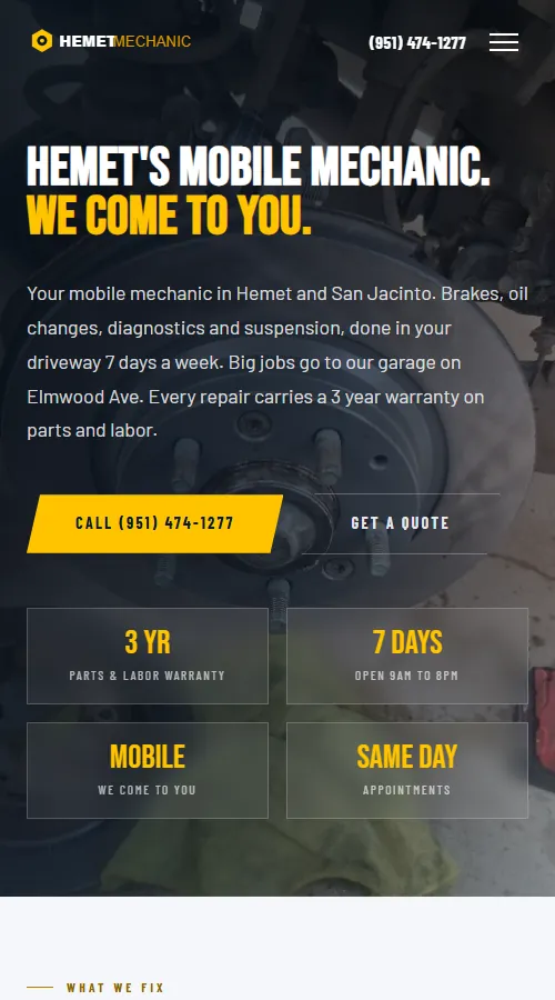
From the field. Hemet Mobile Mechanic, Hemet and San Jacinto, CA
Hemet Mobile Mechanic was rebuilt from WordPress into 13 static pages with a layout made for phones first. On a phone the first screen shows the phone number twice, the warranty, the hours and a Get a Quote button. Nothing covers the number.
Tips & Pitfalls
- Check that your phone version shows the same main content as your desktop version.
- Pop-ups that cover the page on a phone annoy visitors and can hide your call button. Check your chat widget too, since it can sit on top of a button.
- Tables and wide images are the usual cause of sideways scrolling. Stack them or resize them to fit.
Email Me The Free Course
Get your course link in your inbox so you can pick it up on any device. It's free, with no card.